 Devindra Hardawar/Engadget
Of all the streaming live TV services to launch over the past few years, Hulu's makes the most sense. After all, it's the company that managed to craft a successful business out of streaming TV and movies, despite plenty of naysayers. Live TV is simply the next logical step. And unlike Sling TV, PlayStation Vue, and DirecTV Now, Hulu's live service is bolstered by its significant on-demand library, which also includes critically acclaimed original shows like The Handmaid's Tale. But while it all sounds great on paper, Hulu still has a lot of kinks to work out before its live TV service is ready for the average couch potato.
Gallery: Hulu Live TV | 7 Photos
 7
7


 +3
+3
Starting at $40 a month, Hulu's live offering delivers more than 50 channels, 50 hours of "cloud DVR" recording and an ad-free viewing experience for its existing content (which normally costs $12 a month). That's a big step up from Sling TV's entry-level plan, which costs $20 a month with 30 channels. Hulu's pricing makes sense when you consider the amount of channels it offers, along with the wealth of its current library. Clearly, the company isn't aiming to be the cheapest offering on the market. Instead, it's delivering a compelling value for discerning types -- or at least, that seems to be the pitch.
I wouldn't be surprised if Hulu moves towards a cheaper subscription plan eventually, especially when you consider the cost of add-ons like 200 hours of cloud DVR ($15 a month) or unlimited screen viewing (also $15 a month). You can also bundle those add-ons together for $20 a month. Once you start adding new features (Showtime is another $9 a month), it's not long before Hulu's TV service starts to look like your cable bill: complex and expensive.

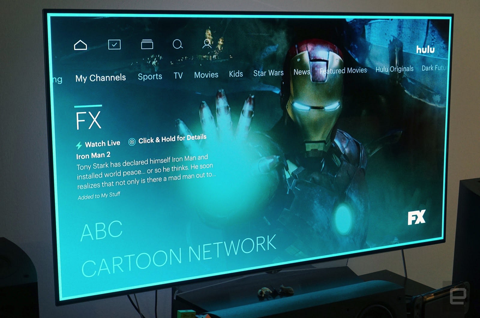
The first thing you'll notice when you start exploring Hulu's live TV service is that there's no channel guide. For me, someone who's spent years growing used to guides on cable and satellite TV, this omission was incredibly disorienting. Instead, Hulu asks you about your favorite channels and TV shows when you first sign on, which show up in the main menu's "My Channels" and "Lineup" sections. Clearly, the company's goal was to integrate the live TV programming into the same interface as its on-demand library. That's certainly noble, but the result is initially confusing. To be fair, all of Hulu's TV competitors have their own interface issues. They each try to recreate the classic channel guide, but they're all a bit hard to navigate and feel slower than I'd like.
If you've used Hulu in the past, you've probably noticed that its interface has gotten a refresh as well. Partially, that's to make room for the new TV sections, but there's no doubt that the service needed a top to bottom spit shine as well. The new UI might also look a bit familiar to anyone who's used Microsoft's Zune players. There's the same emphasis on bold typography and images, and the entire interface is broken up into a series of columns. You can likely thanks Hulu's new head of experience, Ben Smith, for this blast from the past. He joined the company from Microsoft, where he spearheaded the TV and video design for the Xbox One, which takes plenty of design cues from the old Zune UI.
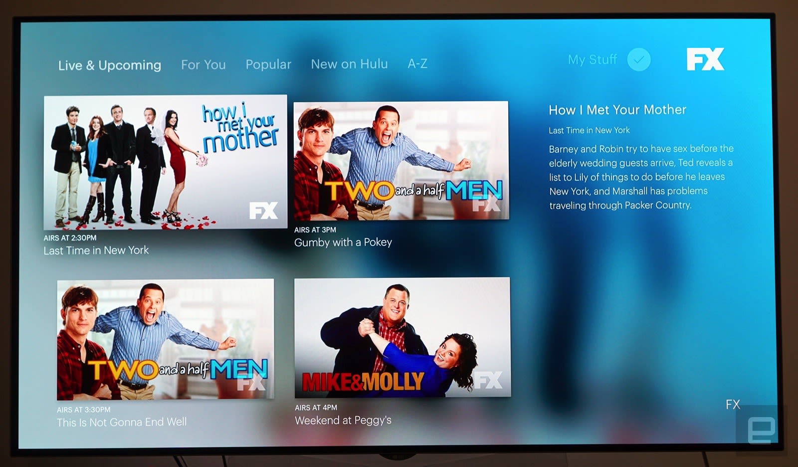
While Hulu's new look makes a striking first impression, there's an extreme learning curve if you're using it on the Apple TV. That's especially true if you're used to Hulu's old design. (The new interface and live TV service are currently only available on the Apple TV, Xbox One, Chromecast and the company's iOS and Android apps.) The first column in the interface, called "Lineup," is dedicated to content you're following, while "Keep Watching" lets you pick up where you've left off on previous shows and films. The "My Channels" section is where you'll be able to see what's playing on your favorite networks. If you want to see what's coming up on those channels, or want to peruse what they have available for on-demand content, you have to hold down the selection button on the Apple TV's remote. That gesture feels alien on the Apple TV, and takes a while to get used to.

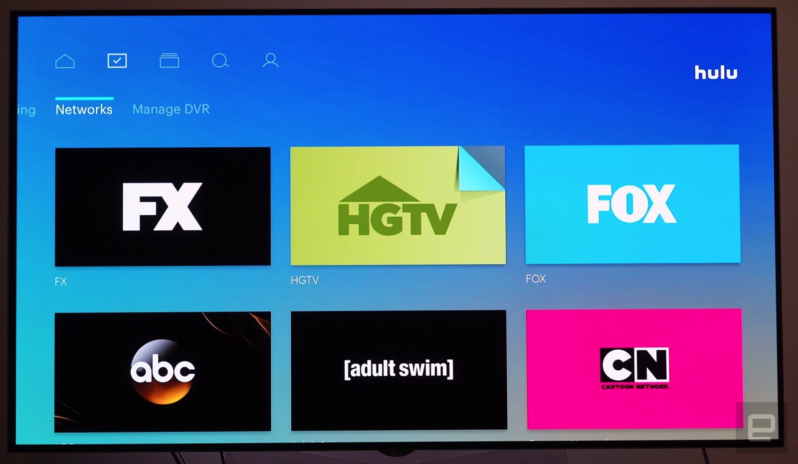
Another design flaw? If you want to watch something that isn't in the My Channels column, you have to head up to Hulu's top menu and choose to Browse TV networks. Then, you're stuck scrolling down a long list of networks until you find what you're looking for. You could just add another network to your My Channels selection, but it's still a painful process. As much as I'd like to see more personalization and bolder UI design, this is an instance where a simple programming guide would be easier for everyone to understand. Hulu's new interface is much easier to deal with on phones and tablets, where swiping and scrolling through columns is more intuitive. I suppose that makes sense, since the core design philosophy of the Zune's interface was focused on mobile devices as well.
When it comes to actually watching live TV, Hulu's service works just as well as the competition. Tuning into a broadcast usually takes around two to three seconds, and the picture quality is typically solid. There isn't much pixelation, and images are generally sharp. Discerning viewers wouldn't mistake it for a solid HD feed from a satellite or cable source, but it's in line with what we've seen from Sling TV and other services. You're basically giving up a bit of quality for the convenience of streaming TV on a wide variety of devices. Hulu's cloud DVR service is useful for recording newer TV episodes and films, but it's limited to 50 hours with the base plan. If you want 200 hours, you'll have to shell out $15 or $20 for one of the add-ons.
Hulu's initial array of channels includes TV addict favorites like HGTV and SyFy, and, surprisingly, it also features all four major broadcast networks, including CBS. But there are still some huge programming gaps that will keep early subscribers at bay. For example, there aren't any Viacom channels, so that leaves out MTV, Nickelodeon and Comedy Central. And, perhaps most damningly, there's no AMC. That means you won't be able to see The Walking Dead -- the most popular show in America -- on Hulu's TV service. Those omissions are particularly surprising since they're all supported by Sling TV, PlayStation Vue and DirecTV Now. There's a chance that Hulu could eventually add these channels, but who knows how long that'll take.
There's a lot to like about Hulu's TV service, but it's hard to recommend to avid TV watchers. You'll likely get a better deal from Sling or one of the other competitors, and you'll have access to even more channels. Hulu's big selling point is its integration of live TV with all of the streaming content it's known for, but aside from The Handmaid's Tale, there's not much that would justify a whole new subscription for many viewers. Once it fills its programming holes, though, Hulu has a chance to create the most compelling live TV service on the market. But please, bring back the channel guide.


 +3
+3