Galaxy S8
Get more info
More91 Scores
Engadget
91
Critic
Not yet scored
Users
Not yet scored
Key Specs
$0.00
Galaxy S8+
Get more info
More92 Scores
Engadget
92
Critic
Not yet scored
Users
Not yet scored
Key Specs
$0.00
Last year's Galaxy S7 and S7 Edge were excellent phones, and so was the Galaxy Note 7... until it started bursting into flames. While some within Samsung were tasked with figuring out what happened and how to prevent it from happening again, others were trying to build a phone that would make people move on. Meet the new Galaxy S8 and S8 Plus.
The Note 7 won't disappear so easily from our collective memory, but I have to hand it to Samsung: The S8 siblings are impeccably built, thoughtfully designed devices. It's not hard to look at these smartphones as the first steps on a road to redemption, and after a week of testing, I can confidently say these are two of the best smartphones money can buy. I just wish its virtual assistant wasn't so half-baked.
Engadget Score Key
Samsung Galaxy S8
91
Pros
- Incredible fit and finish
- Samsung’s interface feels more polished
- Comfortable to hold
- Strong performance
Cons
- Bixby isn’t ready for prime time
- Cameras aren’t hugely improved
- Fingerprint sensor placement is weird
Summary
For the most part, Samsung’s Galaxy S8 is a slam dunk. It’s brilliantly designed, brimming with horsepower and has a beautiful screen. That’s all most people will need, and our gripes are minor. It’s too bad Bixby is still incomplete — its voice interface doesn’t work yet, and the stuff we did get can be hit-or-miss. Fortunately, Bixby is strictly optional, and the rest of the phone is remarkably polished. Long story short, if you’re looking for a new phone, this should be at the top of your list.
Engadget Score Key
Samsung Galaxy S8+
92
Pros
- Comfortable to hold
- Samsung’s interface feels more polished
- Top-notch performance
- Excellent battery life
Cons
- Bixby is incomplete
- Cameras aren’t hugely improved
- Fingerprint sensor placement is weird
Summary
All of the S8’s accolades apply to the S8 Plus as well: It’s a stellar performer that aptly blends beauty and horsepower. Its bigger body, however, means Samsung was able to squeeze a larger battery inside. Couple that with a surprisingly comfortable, narrow body and the Galaxy S8 Plus offers great longevity in a package that won’t make your hands sore. Bixby’s incompleteness is still annoying, as is the location of the fingerprint sensor, but the S8 Plus is still one of the most impressive packages we’ve ever seen.
Hardware and design
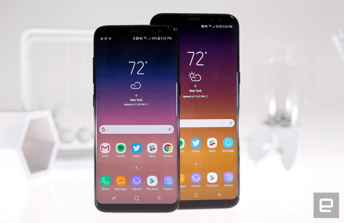
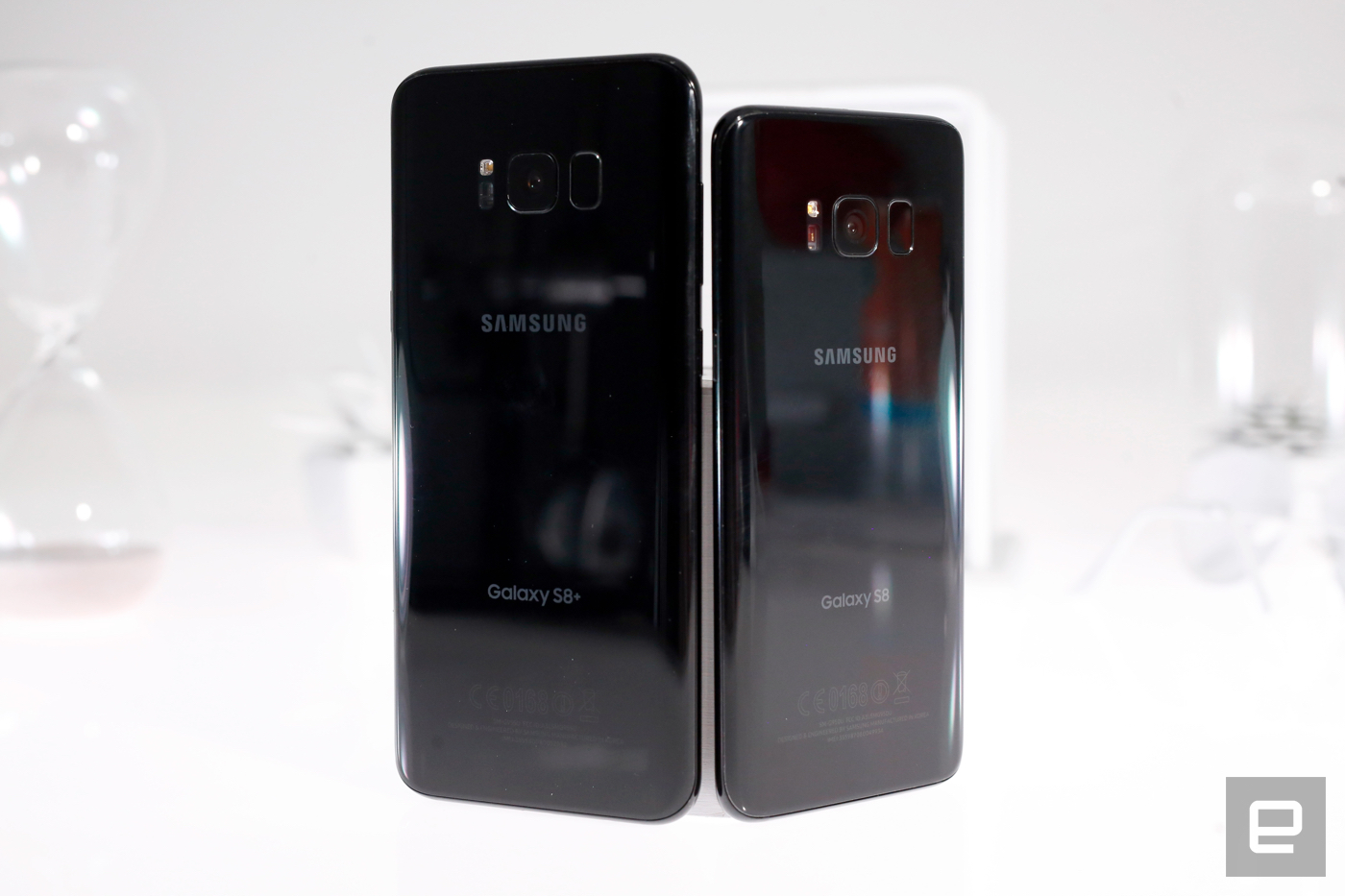
Text and photos don't do the S8 ($750) and S8 Plus ($850) justice. They're beautiful, if not exactly surprising. From their rounded edges to their precisely formed metal-and-glass bodies, they feel like smaller, sleeker versions of the Galaxy Note 7. That's a hell of a compliment, battery insanity notwithstanding — the Note 7 was a beautiful device and I'm glad that DNA lives on. The S8 and S8 Plus's rounded Infinity displays — which are 5.8 and 6.2 inches big, respectively — only add to the phones' appeal. We'll dig into these curved screens more later, but people seemed to like them enough that it didn't make sense to have non-curved flagships anymore.
Gallery: Galaxy S8 and S8 Plus review | 33 Photos
 33
33


 +29
+29
The screens don't extend any farther down the phones' sides than the S7 Edge's display did, but the bezel surrounding them has almost completely disappeared. LG's G6 packs a similarly long 18:9 screen, but the S8 line's eye-catching curves and impressive precision give Samsung a distinct advantage. Like the G6, the screens on the S8 and S8 Plus are longer and narrower than usual, helping them fit more snugly in your hand.
This is especially true of the S8. I thought I'd prefer the Plus's large display, but there's something reassuring and alluring about this smaller body. For one, my hands never strained while reaching for the screen's far corners, and I never felt like I'd drop the S8 because my hand wrapped around it so well. (The phones' backs are made of glass, though, so they still slide around on tabletops.) That's not to say the S8 Plus feels too big. It's plenty comfortable to hold, although your thumbs will still get a workout reaching around the display.
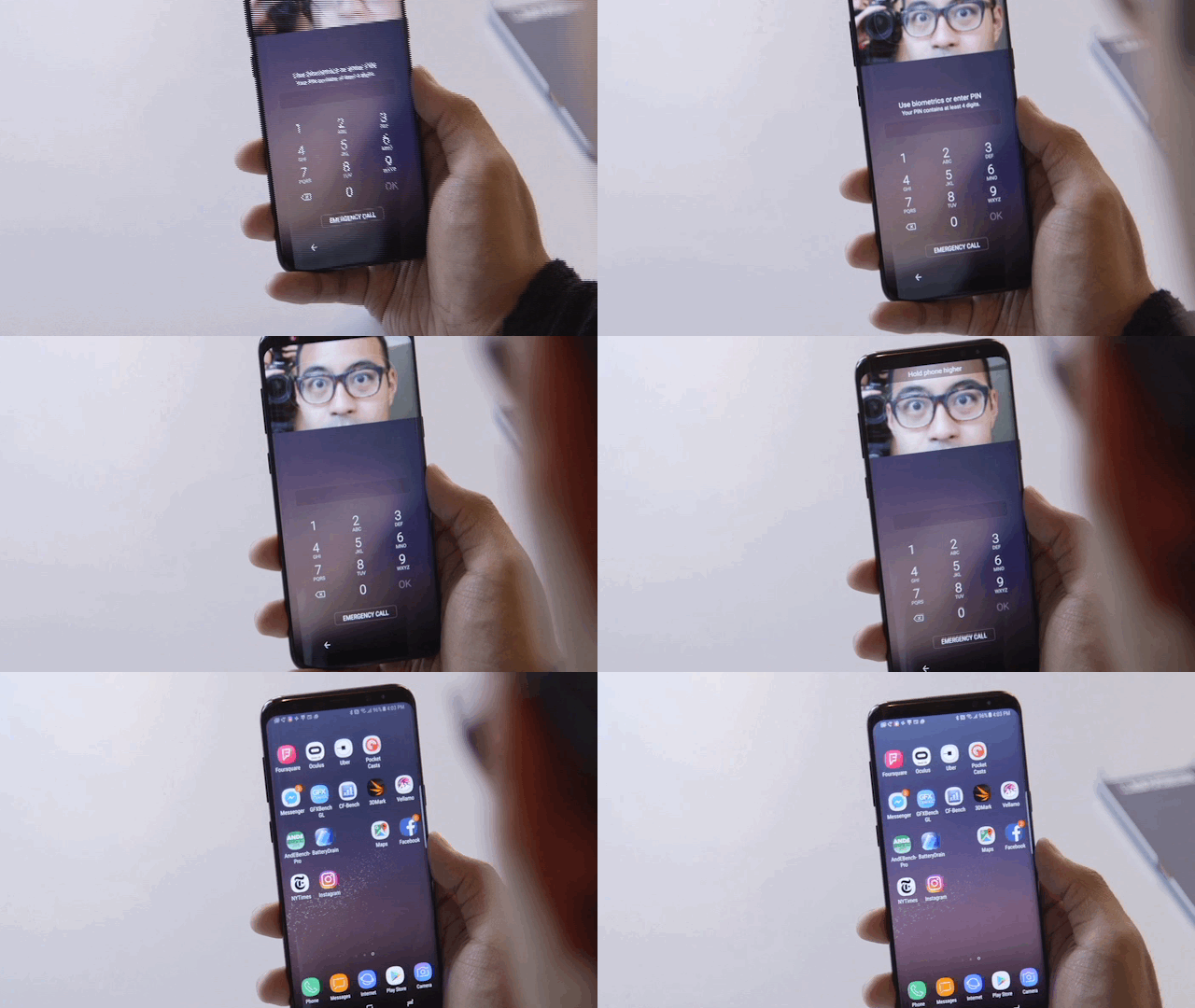
Above the screens are improved, 8-megapixel cameras, and a Note 7-style iris scanner for hands-free unlocking. Most of the time the scanner is fast and frictionless. Often it didn't even show the guide to align your eyes with. Other times I had to open my eyes really wide and move the phone around until I either nailed the alignment or got frustrated and just punched in my PIN.
If PIN codes aren't your thing, there's also the fingerprint sensor on S8 line's back, next to the camera. In prior models, it lived below the screen. I didn't mind the change conceptually, but the placement needs work. The sensor is off center, and a little too easy to miss — I usually smeared fingerprints all over the camera before finding it. And what of that classic home button? It's gone -- your new home button is a pressure-sensitive spot on the screen that vibrates when you push it.
If you're not paying attention, you'd easily miss one of the S8 line's biggest additions: a small button below the volume keys on the phones' left sides. This is what you'll use to invoke Bixby, Samsung's homebrew virtual assistant. The button doesn't do much yet — you'll eventually be able to long-press it to speak directly to Bixby, but for now, it just brings up a screen with upcoming appointments, news and such. Even worse, Samsung has blocked attempts to remap the Bixby key for other functions, which has only pissed off potential power users.
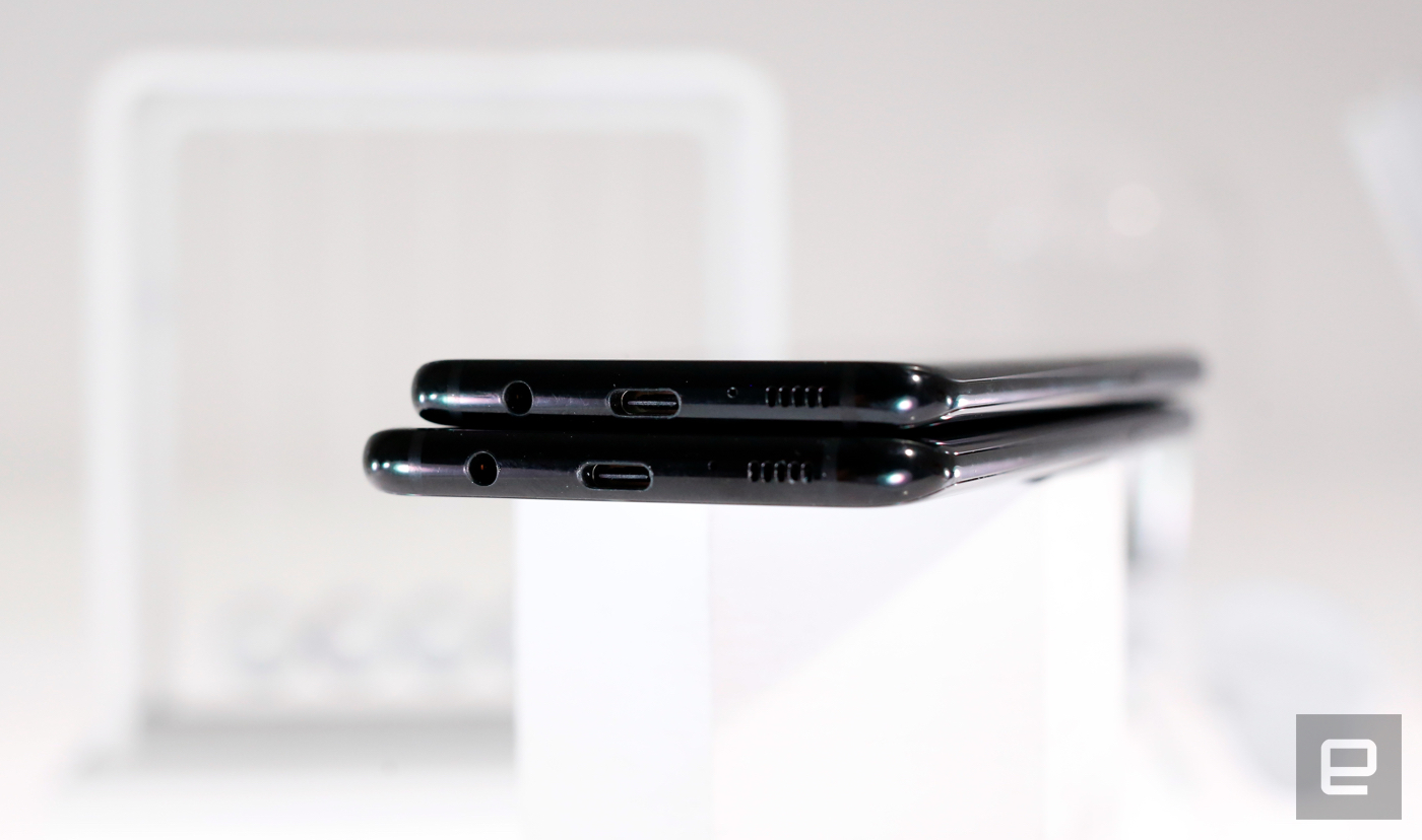
There's a USB-C port on the phones' bottoms, and next to that? The headphone jack. We've seen companies ditching this classic port, claiming that it took up too much space. The S8 and S8 Plus are perfect repudiations of that line of thinking. Oh, and they don't get in the way of waterproofing, either. Both devices are IP68 dust and water-resistant, which meant they could lounge for up to 30 minutes in the ridiculous wine bath we poured.
The stuff inside the S8 and S8 Plus isn't exactly a surprise. Both US models pack Qualcomm's new octa-core Snapdragon 835 chipsets, along with 4GB of LPDDR4 RAM and Adreno 540 GPUs. That horsepower is paired with 64GB of internal storage, and you can add up to 256GB of additional space with a microSD card. In addition to the usual array of LTE and Wi-Fi 802.11 a/b/g/n/ac radios, the S8 and S8 Plus also pack support for Bluetooth 5.0, an updated version of the standard that promises faster data speeds and longer range.
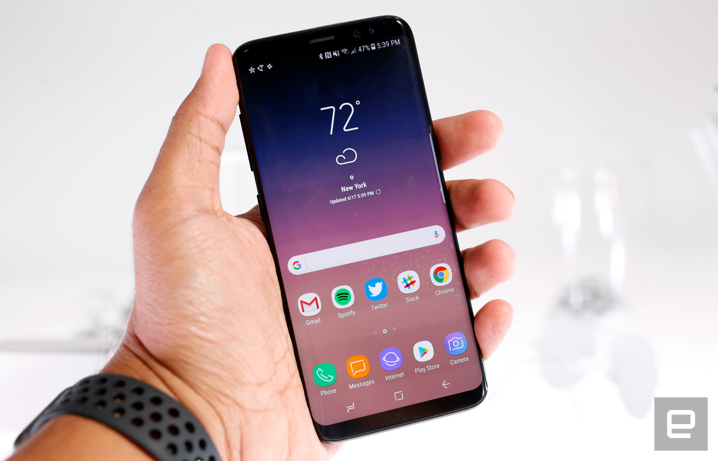
As always, the S8 and S8 Plus are more alike than they are different. The biggest difference aside from the screens are the devices' batteries — the S8 packs a 3,000mAh cell while the Plus contains a 3,500mAh battery. Those of you with keen memories will remember last year's smaller Galaxy S7 also packed a 3,000mAh battery, and the S7 Edge actually had a slightly larger 3,600mAh — the biggest Samsung had used to date. Given the Note 7's nightmarish battery failures, it's no surprise the company didn't push the envelope on this front.
Samsung did an impeccable job designing and assembling these phones. You'll find a few touches that don't feel quite right, like the off-center USB-C ports, but it's clear countless hours went into making the S8 and S8 Plus feel seamlessly elegant. Sorry Apple, HTC, and the rest: For now, Samsung is the reigning king of smartphone design.
Display and sound
 Chris Velazco/Engadget
For the people in search of buying advice, here's all you need to know about the S8 and S8 Plus's screens: They're awesome. Thanks for reading.
But seriously, the Super AMOLED panels here are indeed awesome. Color reproduction on both is excellent and, as always, there are different screen modes in case your tastes are more specific. The screens get bright enough to combat the warm spring sun and viewing angles are excellent, too.
Before anything else though, you'll notice that the S8 and S8 Plus screens are longer than most. While many other smartphone screens stick to the 16:9 widescreen aspect ratio, Samsung built the S8 screens with an 18.5:9 aspect ratio. Why? To squeeze more screen into your hand, for one. Beyond that, the length of the screen makes multi-window multitasking — like the kind Nougat natively supports — a breeze. Don't worry, though: Your apps will automatically scale to fit the entire screen, and they'll look damned good in the process. Some videos, meanwhile, will be flanked by black bars since they can't fill the screen. Samsung isn't the first to go this route, though. Rival LG had the same thought when building its G6, which uses an ever-so-slightly shorter 18:9 aspect ratio.
Samsung calls these screens "Infinity Displays," and they run at resolutions as high as 2960x1440 — a little longer than the usual Quad HD. Note that I said, "as high as." The phones are set to run at "Full HD+" — meaning 2220x1080 — by default. You'll need to jump into the devices' settings to coax them into running at full resolution, which is a must when you fire up some Gear VR games. There's also an option to dial down the screen's resolution to "HD+," or 1480x720, in case you need to squeeze as much life out of the battery as possible. The display will set itself to this resolution when you turn on the most aggressive power saving mode, and it's not too bad, either. Icon edges and text look slightly fuzzier, but it's not ugly.
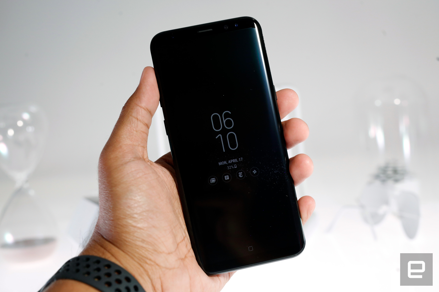
The always-on display is back too, but with a twist. You can customize it further with images in addition to the usual clocks and calendars. Always-on widgets are available now too, if you want to see your calendar appointments or media controls without unlocking the S8. The impact on battery life is negligible, and the sheer amount of customization options can help make your device feel, well, like yours.
Meanwhile, each device has one speaker wedged into its bottom edge, and they pump out loud -- if thin -- audio. They're good enough for podcasts and YouTube videos, but getting the most out of your tunes requires headphones. Good thing, then, that Samsung included a set of AKG earbuds with each S8, and they're leagues ahead of most chintzy pack-ins.
Software
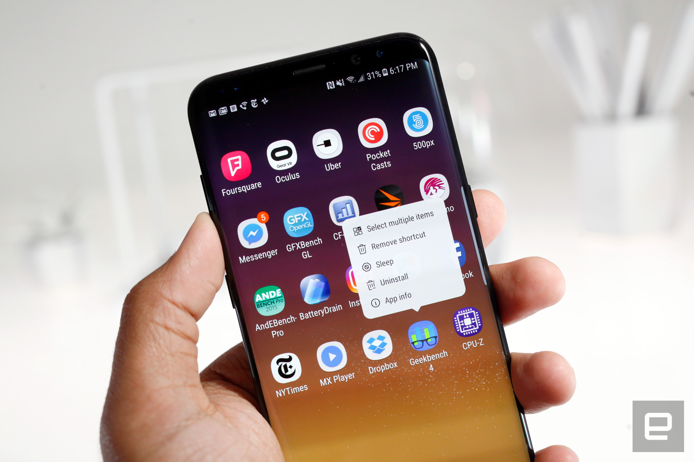
The Galaxy S8 and S8 Plus both ship with Android 7.0 Nougat, but you'd be hard-pressed to tell at a glance. Samsung has once again painted over Google's work. Though, TouchWiz has finally grown up. A lot. Look at the S7's interface: It's full of garish icons and brightly colored circles. The S8's, in contrast, is subtle and thoughtful in its design choices.
For one, the app launcher button is gone — now you just swipe up or down on a homescreen to see everything you've installed. Even better, there's a search bar at the top of the launcher. Managing apps is also easier. Long-pressing an app icon launches a pop-up window with options to add a shortcut to the homescreen, select multiple apps and uninstall or disable the ones you've selected. That last bit is crucial when you're dealing with carrier-mandated bloatware, like the multiple T-Mobile apps on our review unit. In days past, you had to disable uninstallable apps from the device's settings; now you can do it wherever your app icons live.
Gallery: Galaxy S8 and S8 Plus software | 20 Photos
 20
20


 +16
+16
The virtual navigation keys also allow me to fix one of my biggest pet peeves. Samsung devices typically have their recent apps key on the left side and the back key on the right — basically every other Android phone has it the other way around. Fortunately, you can swap the order they appear. You can also now swipe down on the rear-mounted fingerprint sensor to open the notifications shade, a neat trick we first saw on Google's Pixels.
Other flourishes make the S8 line feel like "greatest hits" devices. Since both phones have curved displays, they inherited the Edge line's special shortcut panels. Tapping the little tab on the right side of the screen reveals panels you can load up with favorite apps and contacts and more. I use these as often as I did on the S7 Edge — which is to say rarely.. One panel, called Smart Select, is an awfully neat Note 7 throwback. Long story short, you can select and record parts of the screen and doodle all over them to create GIFs on the fly. For better or worse, /I can't stop doing this./

Also returning from the Note 7 is a Game Launcher app and the device optimizer in settings, which lets you quickly close down background apps and delete unneeded files. My personal favorite feature is the Secure Folder, which allows you to hide files and install separate instances of apps away from the rest of your stuff. For example: Photos taken from the camera app within the Secure Folder can only be viewed when you've successfully unlocked the folder.
Just remember that not all security features are created equal. Take Samsung's facial recognition -- it's fast, but it often couldn't identify me in poorly lit situations. It's also technically possible to fool this facial lock with a convincing photo, so exercise caution. Samsung concedes that this is one of the less secure ways to lock down your phone, but some people definitely dig convenience over security.
Meet Bixby
 Chris Velazco/Engadget
After countless leaks and rumors, Samsung's virtual assistant is finally here. Say hello to Bixby. Oh, wait, sorry, you can't. Bixby's voice interface — the thing people associate most with virtual assistants — doesn't work yet. Want to know how many ounces in a gallon or to see if there are any decent ramen joints nearby? You'll have to chat up Google's preloaded Assistant instead.
Samsung promises you'll be able to control your S8 with your voice as well as you can by tapping on its screen. That would be huge — neither Siri nor Google Assistant offer that kind of granular control. Sure, you can tell Google's Assistant to set your screen brightness to 50 percent, but Samsung promises even more. With that kind of complexity involved, maybe it's no surprise this stuff isn't done yet.
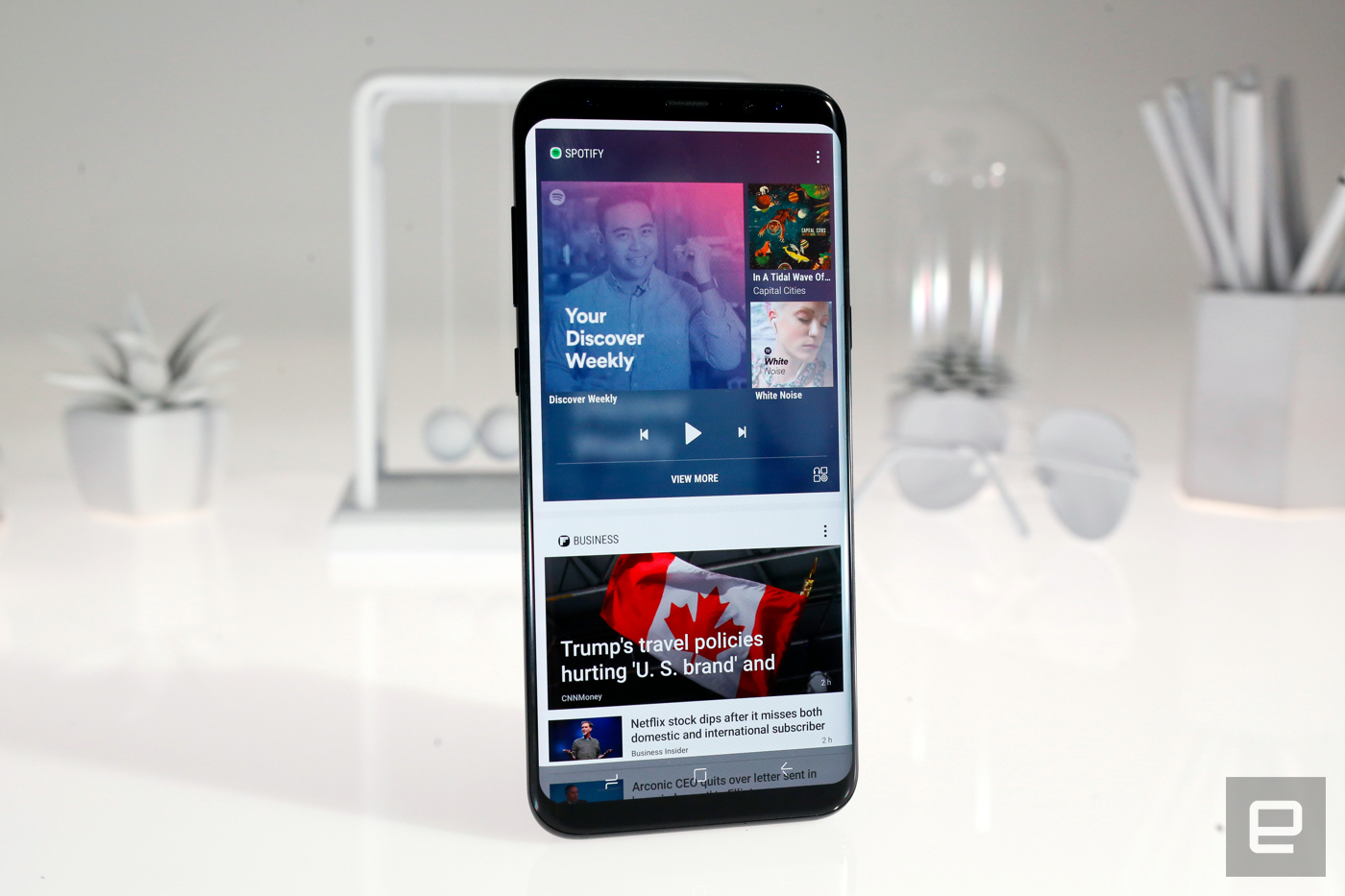
So, if Voice doesn't work, what did we get? Well, a homescreen, for one. Once Bixby is enabled, swiping right on the homescreen or mashing the dedicated button brings up the Bixby Home panel. There, you'll find your calendar appointments, the local weather, your daily activity, reminders and lots of news from Flipboard. Right now there are only a handful of third-party apps that connect to Bixby Home, including CNN, Facebook, Twitter, Foursquare, Spotify and Giphy. It's a perfectly serviceable alternative to Google Now. My only real gripe is that it sometimes takes longer than expected to launch Bixby Home by tapping the Bixby button — I often had to hit it multiple times (on both devices, even).
Bixby's other, more interesting half is called Bixby Vision. It's basically an augmented reality camera that tries to identify what's in front of you. I'll admit, my expectations might have been out of whack here. I wanted to use Bixby as the ultimate shopping tool, snapping photos of things I wanted around New York City and buying them from the handy Amazon links served up by Bixby. Alas, it just isn't smart enough to identify specific brands or makes. At best, Bixby sees "black shoes" or "red backpack," and the resulting Amazon links aren't particularly helpful. Still, it's pretty good at identifying clearly labeled items. I pointed Bixby at a bunch of things in a grocery store. and it properly identified the juices and cheese snacks I bought.
Bixby Vision is for more than just shopping, though. Thanks to a partnership with Vivino, Bixby can identify bottles of wine then display ratings and reviews for what you're about to crack open. That's the part of Bixby Vision that worked the most consistently. Although it does seem to think most bottle-shaped things are bottles of wine, so you'll probably see the Wine option appear at inappropriate times. You can also use Bixby to search for images on Pinterest similar to ones you've already taken. It's a neat touch and good for finding art you might like, but it's not the most useful feature.
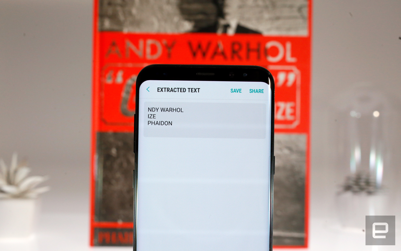
It's too bad the really useful stuff — visual text extraction and translation — is hit or miss. The problem with both is that Bixby is really bad at understanding what text should be selectable in an image. Let's say you're trying to translate a book cover.
In an ideal world, you point Bixby at the book, hit the "Text" button, your phone figures what is actually text, you select it, and out comes a translation. Sometimes, though, Bixby doesn't know when there's text you want to translate or extract, so the "Text" button doesn't appear. And other times, when the button does appear, it doesn't parse all of the text properly so you can't translate it. When it works, it works surprisingly well — I translated a handful of Japanese signs just fine when Bixby could tell I was looking at words. Ultimately, Bixby just lacks the sort of speed and consistency that could make this feature a real must-have.
I have high hopes for Bixby. After all, it took years for Siri to become really useful. So expecting Samsung's assistant to be equally functional in less time isn't really fair. Still, there's no question that Bixby is the most half-baked thing you'll find in these two otherwise excellent smartphones.
Camera
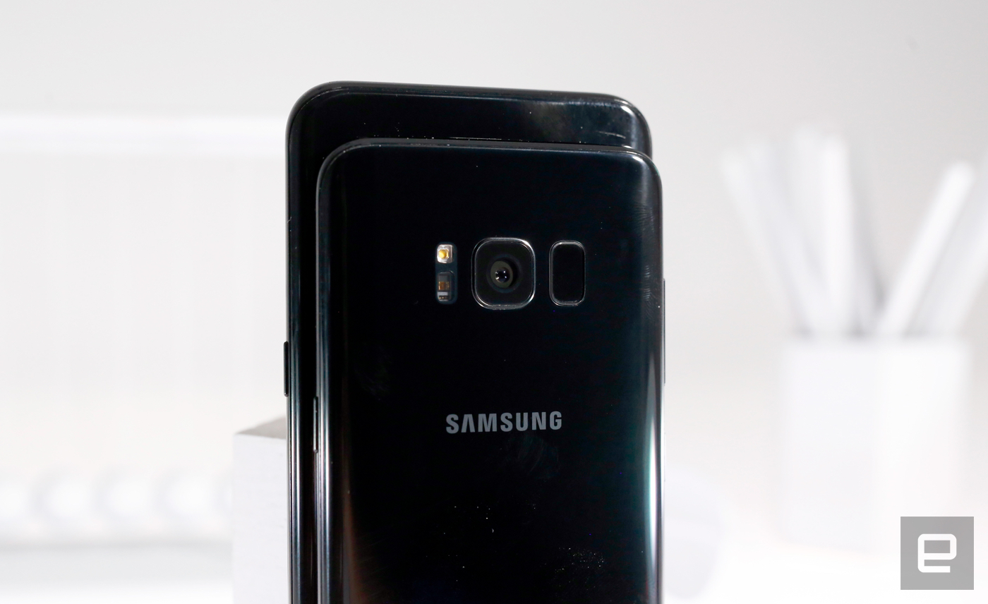
The 12-megapixel sensors on the back haven't changed much since last year. That's not a bad thing since they were great cameras to start with; just don't expect any huge jumps in quality. Photos were uniformly well-exposed with excellent color reproduction. And as always, these dual-pixel cameras focus incredibly fast, and the optical image stabilization does an excellent job keeping subjects crisp and clear. Low-light performance was in line with the S7 cameras, which is no surprise since they both have 1.4µm sensor pixels and f/1.7 apertures. Still, expect to see the occasional fuzzy edge and less-accurate focusing when it gets a little too dark. Samsung says it improved the processing pipeline so there's no lag between capturing a shot and being ready to snap the next.
Gallery: Galaxy S8 and S8 Plus camera samples | 25 Photos
 25
25


 +21
+21
The S8 and S8 Plus also double as solid video cameras. They capture quality footage at up to 4K with great colors and minimal jittering. I just wish Samsung offered more flexibility — there's a record button, and that's about it.
There is an improved 8-megapixel front camera with a wider field of view for group selfies. It has a f/1.7 aperture too, so it's decent enough in low light and in general it's a great performer. Selfies were clean, detailed and nicely colored, especially when viewed on the punchy AMOLED screen. Even better, you can hold up a palm to snap a selfie, no fumbling with buttons required.

Samsung also spent time cleaning up the camera interface, which was already pretty elegant. You switch between the front and rear cameras with a swipe up or down, and the list of usual photo modes — food, selective focus, slow motion and "pro" — is smaller and more streamlined. This time, though, swiping right opens up a list of Instagram-friendly color options to give your photos a little more character. And speaking of character, Samsung took a page from Snapchat's playbook and added face-tracking filters that are bizarre and fascinating. They range from the cutesy (kawaii cats and rabbits eating carrots) to stranger fare, like a cowboy filter that fires a pistol when you blink. The S8 and S8 Plus come with 31 of these filters, and if nothing else, they're perfect for amusing toddlers who are otherwise busy getting loaded on Easter candy.
Performance and battery life
I'll be brief: The S8 and S8 Plus are effortlessly fast machines, and hardly anything I threw at them over a week of testing got them to stutter. This is mostly due to the shiny new Snapdragon 835 and 4GB of RAM onboard. Bixby is often a little slow to launch, but swiping through Samsung's improved interface and jumping between running apps was painless. If this is what the 835 is capable of, I can't wait until these things are everywhere. Workday multitasking, games like Hearthstone and Dead Trigger 2, even playing emulated GameCube games — it all ran fabulously. I unconsciously stopped thinking about performance altogether. As you'd expect, the S8s killed it in our usual suite of benchmarks, too — hardly anything came close.
Galaxy S8Galaxy S8 PlusLG G6Google Pixel XLGalaxy S7 EdgeAndEBench Pro 15,888 16,064 10,322 16,164 13,030 Vellamo 3.0 5,519 6,930 5,046 5,800 4,152 3DMark IS Unlimited 36,806 35,626 30,346 29,360 26,666 GFXBench 3.0 1080p Manhattan Offscreen (fps) 54 55 42 48 47 CF-Bench 67,307 64,441 29,748 39,918 46,290
Anyway, none of this would matter if the phones had lousy batteries. News flash: They don't. The smaller S8 routinely lasts between a day and a half and two days of consistent use. The S8 Plus's bigger battery gets me closer to two full days of use on a single charge. That's with the screen set to its maximum resolution, too — expect even better battery life if you dial the displays down to Full HD+ or lower.
They also fare well in our standard video rundown test, where we loop an HD video at 50 percent screen brightness while the phones are connected to Wi-Fi. The S8 and its 3,000mAh battery stuck around for 13 hours and 27 minutes — just a hair better than the S7 and the Google Pixel and well ahead of the bigger 3,300mAh battery in the G6. The clear winner, though, is the S8 Plus and its 3,500mAh battery. It clocked in at 15 hours and 8 minutes, longer than the Pixel XL, Note 7 and Moto Z Force.
The competition
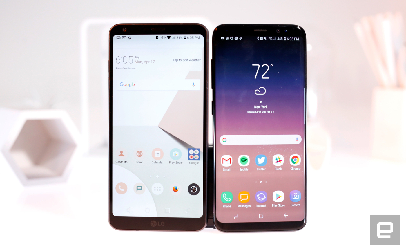
We're not even halfway through 2017, so some of the best smartphones of the year may still be waiting in the wings. For now, though, there aren't many devices with the chops to stand up to the S8 and S8 Plus. The biggest competitor is probably LG's G6, a device with a long screen of its own. It's far more sensible than last year's G5 and, while it can't win when it comes to pure power, it's surprisingly flexible dual camera and great screen make it a solid alternative.
If we're considering the G6, we might as well throw in the Google Pixel and Pixel XL since they pack the same chipset. Beyond having a choice of device sizes, the Pixels also double as incredible cameras (I think they're still a little better than the S8's), and the phones are guaranteed to get updates from Google as quickly as possible. Sure, the S8's interface has improved dramatically, but some people will always prefer the cleanliness of stock Android.
And in case you haven't pledged allegiance to a mobile platform yet, there's also Apple's iPhone 7 and 7 Plus. I still personally prefer the breadth and quality of Apple's app ecosystem... though the S8's impeccable design might get me to switch teams soon.
Wrap-up
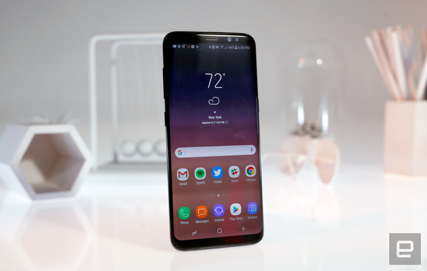
The Galaxy S8 and S8 Plus aren't perfect, but they're as close as Samsung has ever gotten. That's a hell of a rebound for a company whose phablets... well, you know. Beyond the gorgeous design and the boost in horsepower, they feel like devices built in response to our preferences and nitpicks. That's not something you see everyday. Bixby's limited functionality and lack of consistency is a real bummer, but it's not a deal-breaker. (We'll return to this review when Bixby Voice is finally up and running.) In most other areas, Samsung has outdone itself. The year is still young and we'll certainly see strong responses from Google and Apple. But for now, if you're looking for a new smartphone, the S8s should be at — or very close to — the top of your list.


 +29
+29


 +16
+16


 +21
+21